Author Archives: Bill

Insulin is a double-edged sword with a pointy tip

Visceral fat (VAT) is bad, more VAT is worse; believe, or do a Google on it.  And it is my contention that insulin, or more specifically diets that promote insulin spikes, hyperinsulinemia, or insulin resistance, is the primary driver of VAT accumulation.

The balance between fat accumulation and fat loss is regulated by four distinct mechanisms, which are similar in myriad biological systems:

1)      Enhanced fat accumulation

2)      Reduced fat accumulation

3)      Enhanced fat loss

4)      Reduced fat loss

They are not mutually exclusive, but small shifts in any of them can cause big changes in fat mass with vast implications for metabolic outcomes.  And to complicate matters further, we are talking about two distinct fat depots which are independently regulated by those mechanisms… there are a lot of possibilities.

Subcutaneous fat (SCAT), the kind associated with a “pear” body shape, is a relatively safe place to store excess energy; i.e., safer than VAT or other ectopic depots such as liver or muscle.  And in lean healthy individuals, SCAT is more sensitive than VAT to the anti-lipolytic effects of insulin.  In other words, insulin favors the storage of excess energy in the relatively safer SCAT.  But when insulin levels spike, insulin resistance and hyperinsulinemia develop.  This causes the reverse to occur- fat mass accumulates in VAT.  Fortunately, this is completely reversible by weight loss or adopting a low-insulin diet.

Evaluation of two dietary treatments in obese hyperinsulinemic adolescents (Armeno et al., 2011 Journal of Pediatric Endocrinology and Metabolism)

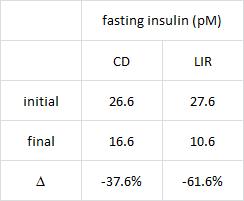
This study examined the effects of two isocaloric hypoenergetic diets of identical macronutrient composition that differed markedly in their ability to spike insulin levels for 16 weeks in 86 obese Argentinian children.

CD = control diet; LIR = low insulin response diet.

Divide and conquer

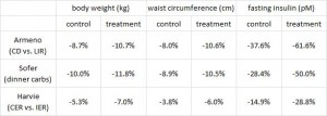
After 16 weeks, the LIR group lost more weight than CD, and waist circumference declined to a greater extent.
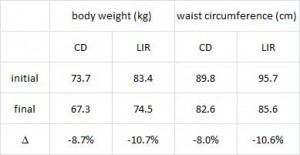
And of particular relevance to my current thesis, the decline in waist circumference was disproportionately greater (relative to the body weight loss) in the LIR group compared to CD.

Importantly, this correlated well with a greater reduction in fasting insulin levels in LIR relative to CD.

Waist circumference is a good indicator of VAT.  Reduced insulin levels improved insulin sensitivity, which promoted a shift away from VAT- an example of how small shifts can have a big impact on the abundance of fat mass stored in one depot relative to another one.  And this also had a functional impact on metabolic outcomes- AST, a marker of liver dysfunction, was reduced to a greater extent in the LIR group relative to CD.

Why do I attribute these effects to reduced insulin levels?  Aside from the sound (IMO) biological rationale mentioned above, it occurs consistently regardless of how insulin levels are reduced.

Greater weight loss and hormonal changes after 6 months diet with carbohydrates eaten mostly at dinner (Sofer et al., Nature Obesity)

While the Armeno study in obese children (above) reduced insulin levels with a diet that didn’t spike insulin levels ever, this study did so by restricting the insulin spike to once per day, at dinner time.  This was a longer study (6 months) in an older population (39 Israeli adult police officers).

Interestingly, and similar to the Armeno study, the experimental group (dinner carbs) lost more body weight and experienced a greater reduction in waist circumference than the control group.
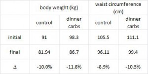
As in the Armeno study, the reduction in waist circumference was disproportionately greater in the experimental group than in controls, and this also correlated with a greater reduction in fasting insulin.
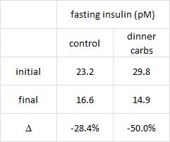
This was accompanied by functional improvements as well- the experimental group experienced a greater increase in HDL and a bigger decline in the inflammatory insulin-desensitizing cytokine TNF-alpha.

The similarities between these two studies is eery, especially given the markedly different patient populations (obese Argentinian children vs. obese Israeli cops) and study duration (4 months vs. 6 months).

Why do I attribute these effects to reduced insulin levels?  Aside from the sound (IMO) biological rationale mentioned above, it occurs consistently regardless of how insulin levels are reduced.

The effects of intermittent or continuous energy restriction on weight loss and metabolic disease risk markers: a randomized trial in young overweight women (Harvie et al., 2011 International Journal of Obesity)

This study compared the effects of a chronic 25% energy restricted diet (CER) to an intermittent energy restriction (IER) which reduced food intake only on Monday and Tuesday while allowing ad lib food intake for the rest of the week in 89 overweight young British women for 6 months.

Similar to both of the above studies, the experimental group (IER) lost more body weight and experienced a greater reduction in waist circumference than controls.
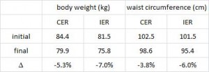
And this too was accompanied by a greater reduction in fasting insulin levels.
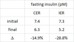
Function improvements occurred as well- the experimental group experienced a greater increase in insulin sensitivity and the insulin-sensitizing hormone adiponectin.

These findings further contribute to the phenomenally similar effects of reducing insulin levels, in three markedly different experimental paradigms (obese Argentinian children vs. obese Israeli police officers vs. overweight British women):

Why do I attribute these effects to reduced insulin levels?  Aside from the sound (IMO) biological rationale mentioned above, it occurs consistently regardless of how insulin levels are reduced.

Could greater VAT loss be due to weight loss and not reduced insulin levels per se?  It’s possible, but given the effects of pharmacologically reducing insulin levels (see HERE) it seems like insulin, not body weight, is the main driver.

You just gotta get those insulin levels down

  1. Eat fewer foods that spike insulin
  2. Restrict carbs to one meal per day
  3. Intermittent energy restriction


calories proper


Fructose vs. The Laws of Energy Balance

Exclusively from literature featured in past blog posts, e.g. HERE and HERE, excessive fructose consumption seriously deranges metabolism.  Furthermore, fructose pre-disposes to and exacerbates leptin resistance, which is one of the most proximal causes of obesity viz. overeating.  However, this doesn’t exonerate processed foods, modern grain-based diets, or trans-fats because they frequently co-exist.  Many popular breakfast cereals contain all three, and IMO a fructose-free breakfast cereal wouldn’t do much in the treatment and/or prevention of obesity.  Just eat better.  And we might even get “low-fructose” foods on grocery store shelves in the near future (but don’t hold your breath, food companies LOVE their fructose).

Consuming fructose-sweetened, not glucose-sweetened, beverages increases visceral adiposity and lipids and decreases insulin sensitivity in overweight/obese humans (Stanhope et al., 2009 Journal of Clinical Intervention)

Consumption of fructose-sweetened beverages for 10 weeks reduces net fat oxidation and energy expenditure in overweight/obese men and women (Cox et al., 2011 European Journal of Clinical Nutrition)

Metabolic responses to prolonged consumption of glucose- and fructose-sweetened beverages are not associated with postprandial or 24-h glucose and insulin excursions (Stanhope et al., 2011 American Journal of Clinical Nutrition)

These studies came out in a few separate publications, were ultra-high budget, and used very advanced techniques to quantify energy expenditure and body composition.  AND much care was taken to ensure the subjects were truly weight stable when appropriate (inpatients for two weeks in the beginning and end of the study so all of their food intake and anthropological measurements could be assessed accurately).  The experiment consisted of feeding subjects a sugar-sweetened beverage, either glucose or fructose, equivalent to 25% of their daily energy requirements.

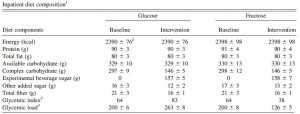
During the inpatient portions, subjects were fed a standardized diet of 15% protein, 20% fat, and 55% carb:

Note the differences in GI & GL (bottom two rows).   Fructose has a negligible impact on glycemia because, well, it’s fructose (not glucose), and it doesn’t magically transform into glucose after ingestion.

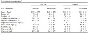
When left to their own free will, the patients pretty much ate the same:

In general, after a period of adaptation, their intake of other foods should have declined by 25% to compensate for the additional calories from the sugar drinks, but sugar seems to hijack the appetite set point – first row in the table above; calories were 20-25% higher, almost the exact amount of calories in their sugar drinks – therefore all subjects gained a few pounds (1% of initial body weight) (and then they went back on good behavior when they were being observed in the metabolic ward):

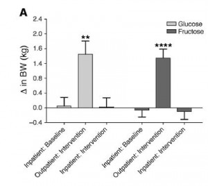
Herein we have the first unexpected pearl: the fructose group gained visceral fat (VAT) whereas the glucose group gained subcutaneous fat (SCAT) (eerily similar to what is seen with trans-fats!).

Exhibit A:

The glucose group actually gained slightly more fat mass than the fructose group, but most of the excess weight was deposited in the relatively inert SCAT, or “extraabdominal” regions.  The fructose group, on the other hand, gained it all in VAT (apple, not pear).  Abdominal fat and waist circumference increased significantly in the fructose drinkers.  FYI that is very interesting.  And it wasn’t caused by individual differences- it’s not like some people were more predisposed to gain more VAT than SCAT; these subjects were randomized.  Diet, or more specifically, dietary sugars caused this differential fat storage.  Amazing.

Exhibit B:

This figure shows the differences in fat gain.  The glucose group gained less VAT than SCAT, while the fructose group did the opposite.  Genetics had nothing to do with this.  It is diet.  It is nutrition.  For the love of God people, it is nutrition.

In lieu of the recent publication by Dr. Bray, it is interesting to note the second pearl: an example of the irrelevance of the laws of thermodynamics (universal) with respect to the Laws of Energy Balance (conjured up by yours truly).  Namely, energy expenditure is affected by the diet… IOW, the laws of thermodynamics are not violated, but all calories are not equal (THERE. I said it… on the record, in cyberspace, for all of eternity).

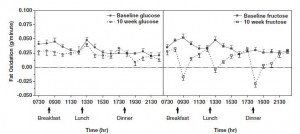
This nuance is introduced in figure 2:

Divide and conquer

On the left, fat oxidation is slightly lower in the glucose group.  This is expected, because carb oxidation should have increased due to the increased carb consumption (in the form of the glucose drink).  But as seen in the right panel, fat oxidation declined significantly in the fructose group.  From this, we would expect fat gain to be greater in the fructose group compared to the glucose group … but it wasn’t.  Artefact?  Error in measurement?  I don’t know how, but this appears to be a violation of the Laws of Energy Balance (which is impossible).  UNLESS energy expenditure declined more in the fructose group than in the glucose group.

Exhibit C:

And it did!  Both groups increased their sugar consumption (by design), and energy expenditure declined in both groups (they all gained weight).  The fructose group gained about a pound less than the glucose group, but consumed slightly fewer calories on average.  So the reduced fat oxidation didn’t enhance fat gain in the fructose group because food intake declined proportionately; and they maintained energy balance relative to the glucose group because energy expenditure was slightly lower (this is complicated).

To be clear, the fructose-induced VAT deposition is not explained by reduced fat oxidation as that would imply less fat gain overall, relative to the glucose group (which didn’t happen).

Fructose-induced VAT deposition is a product of the deranged nutrient partitioning caused by fructose itself.  It’s a dangerous lil’ bugger.  How does fructose conspire with the metabolic machinery to selectively enhance visceral adiposity?  Not sure, but it might have something to do with insulin.  Glucose but not fructose stimulates insulin secretion, and SCAT is more sensitive to the anti-lipolytic effects of insulin than VAT.  The overall fat gain was similar in both groups, in accord with the Laws of Energy Balance.   But insulin tends to drive fat into metabolically safer SCAT.  An example of this concept in practice can be seen by looking at obese insulin resistant people.  In this population, SCAT is less responsive to insulin, relativeto lean people, and indeed, they have significantly greater visceral fat mass.  So fructose doesn’t trigger an insulin response, which means excess calories are less likely to be stored in SCAT, but since this can’t violate the Laws of Energy Balance the calories must go somewhere…  deposited into the notorious VAT bank where they not only still make you fat but also initiate a storm of metabolic abnormalities.


calories proper

Body Mass Index, Op. 42

BMI: everything you wanted to know but were afraid to ask

or

More than your friends know about the BMI

BMI, or “body mass index,” is an index of adiposity and is calculated as body weight divided by height-squared (kg/m2).

BMI is usually divided into 4 categories: underweight, healthy weight, overweight, and obese.  These categories have specific meanings and there is a physiological rationale for culture-specific cutoff points.  In the United States, healthy weight is classified as BMI 20-25 and obesity is BMI > 30.

N.B.  The rationale for setting the obesity cutoff at 30 and not 28 or 32 is that Americans with BMI < 30 experience fewer health problems, e.g., lower rates of diabetes, than those > 30.  It is NOT the average, nor does it have anything to do with odd biological phenomena like adipocyte cell number or maximal obesity capacity.  The cutoff for Chinese is ~25 because > 25 is associated with significantly more health problems than < 25.  The cutoff for Chinese (25) is not lower than Americans (30) because Chinese are on average leaner.  Chinese ARE leaner, but that’s not why the cutoff is lower.  The cutoff is lower because it is based on disease risk, not average body weight.

This is complicated.  Trust me.

Example #1.  An American living in the United States with BMI 27.5 is classified as overweight, but a Chinese with BMI 27.5 is classified obese.  These terms have more to do with disease risk than body weight.

Example #2.  On average, Americans are fatter than Chinese.  But Chinese have higher rates of diabetes.  Chinese get diabetes at a lower BMI, on average, than Americans.  THIS is why the obese BMI has a lower cutoff for Chinese.  Pound for pound, Chinese are more diabetic than Americans and studies like Ni-Hon-San suggest this is not genetic, but rather environmental or dietary.

BMI 101, Americans are good at getting fat without diabetes.  And they’re really good at getting fat, but that’s got nothing to do with BMI category cutoffs.

Deriving ethnic-specific BMI cutoff points for assessing diabetes risk (Chiu et al., 2011 Diabetes Care)

Divide and conquer

No study more robustly exhibits the gravitas of BMI categories.  From this relatively random sample, whites and blacks arethe heaviest, followed by South Asians (Indian, Pakistani, etc.), and then Chinese, who are the leanest.

Table 1.

If the obesity cutoff is universally set at 30, then 16.5% of whites, 14.7% of blacks, and 6.9% of South Asians, and a paltry 2.2% of Chinese are “obese.”  And THIS is why the obesity cutoffs are not universal.

Table 2. Incidence of diabetes (per 1,000 person-years)

The first row in Table 2 shows the incidence of diabetes among those at a healthy body weight.  It is fairly low, in all except for those hailing from the diabetes capital of the world, India, whose unlucky population experiences 3x more diabetes than whites (cough cough diet cough).  But now focus on the first column, diabetes incidence in whites with a healthy body weight (4.1) vs. overweight (10.0) vs. obese (25.6).  There is a clear increase across the groups which confirms the usefulness of these specific BMI cutoff points for this population.

But what happens when these cutoffs are applied to Chinese (Table 2, third column)?  Holy crap, 79.6% of Chinese with BMI 30 have diabetes!!  Actually, overweight Chinese are almost as diabetic as obese whites (despite being ~25 pounds lighter).  But while this clearly shows a BMI-independent predisposition toward diabetes among Chinese (cough cough diet cough; as blogged about previously), it also demonstrates the futility of universal BMI cutoff points.  Since the cutoffs are based on health risks, to say someone is obese should be associated with a specific risk.  If the cutoff was universally at BMI 30, then we could conclude nothing meaningful about the incidence of diabetes in obesity since the range would be enormous (25.6 – 79.6).  In other words, the word “obese” would be rendered useless by universal BMI cutoff points.

Table 3. Incidence of diabetes (per 1,000 person-years)


Lowering the obese cutoff to 27.5 for Chinese levels the playing field.  30.9% of Chinese with BMI > 27.5 have diabetes, which is roughly equivalent to the 25.6% of whites with BMI > 30.  Now we can clearly say “obesity” is associated with increased risk for diabetes, and this risk is increased equally in an ethnic-dependent manner.  By normalizing to disease burden, BMI categories have significantly more clinical value.

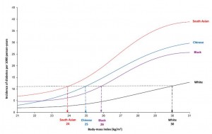
Clearest depiction of this concept:

To most accurately normalize BMI categories, one could ask at which BMI certain ethnic groups experience the same diabetes incidence as obese whites, for example.  By graphing the data in this manner, it is clear that Indians, Chinese, and blacks aren’t very good at getting fat.  Just a few extra pounds and here comes the diabetes.  At least for Chinese, it’s a good thing they tend to stay lean (Table 1).

And this isn’t restricted to diabetes…

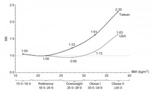
Are Asians at greater mortality risks for being overweight than Caucasians?  Redefining obesity for Asians (Wen et al., 2008 Public Health Nutrition)


The relative risk for all-cause mortality increases with body weight.  As per the figure above, e.g., a 225-pound American has the same relative risk for all-cause mortality as a 200-pound Chinese.  Alternatively, a Chinese with BMI 25 has the same relative risk for all-cause mortality as an American with BMI 30.  Thus, ethnic specificity is mandatory to establish clinical meaningfulness to the word “obesity.”


calories proper


the great difficulties of weight loss

As usual, the media buzz and author’s own interpretations are inaccurate, exaggerated, or downright bizarre, but the study was fairly well-executed so it isn’t without a few novel insights.  Actually, some of their findings are quite interesting.

Long-term persistence of hormonal adaptations to weight loss (Sumithran et al., 2011 NEJM)

50 obese patients underwent an intensive ultra-low calorie diet to lose ~15% of their body weight in 10 weeks, and returned one year later for a battery of testing.  Two common problems with this type of dietary interventions studies are 1) failure to achieve significant weight loss, and 2) weight re-gain.

The first problem was solved by removing all food-based decisions by providing the subjects with a nutritionally adequate liquid diet (Optifast VLCD, Nestle; nutrition information).  By nutritionally adequate, I am specifically referring to vitamins and minerals…  the calories in Optifast VLCD (150 kcal tid) are comprised of 46% protein, 14% fat, 39% carbs… 24% of the total calories come from sugar.  This plus 2 cups of “low-starch vegetables” is all the subjects consumed during the weight loss period.  The macronutrient ratios extreme hypocaloric level is incompatible with anything normal (e.g., the Minnesota Starvation Studies).  So while this is not a recommended weight loss strategy (not viable for the long-term, horrible side effects due to fatty acid deficiency, etc.), it is certainly effective.

The second problem was solved by [brilliantly] excluding data from participants who dropped out or who failed to maintain the weight loss.  Also known as a “completer’s analysis,” this is the bane of dietitians, many of whom prefer the “intention to treat” (ITT) analysis.  ITT includes data from every subject who began the intervention and is justified because it is said to reflect what would actually happen to a group of real-life patients.  I usually dislike ITT because it considerably dilutes the actual effects of the intervention with data from subjects who didn’t complete the intervention.  In this study, ITT is particularly inappropriate because the authors wanted to see the effects of long-term adaptations to weight loss; if the patients dropped out because of inadequate weight loss, then their biochemical variables do not reflect long-term adaptations to weight loss, which was the whole point of the study.  In more complicated cases, dropouts aren’t random, so the results may be restricted to a very specific mystery group of people (i.e., NOT the people you to which you think they apply).  Thus, the second problem was solved by the author’s choice of statistical analysis.

Divide and conquer

Figure 1.

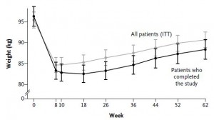
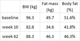
They started out at 96.3 kg (~212 lbs) with 51.6% body fat (FTR, that is a LOT of excess fat mass) and lost 13.5% of their initial body weight during the 10-week weight intervention (pretty good for diet alone), and gained half back by the end of 1 year (disappointing but common).

#1. The authors stressed throughout the entire manuscript that the subjects were weight-stable at a reduced body weight for the subsequent year; it was built-in to the intervention (as described in the Methods section), and it was consistently referenced in the discussion.  However, according to Figure 1, this is horribly incorrect.  In fact, I would say the subjects were in a positive energy balance for the entire year.  This doesn’t mean the study is worthless; it just means that we aren’t talking about people who lost 30 pounds and kept it off.

#2a.  These subjects were 56 ± 10 years old and probably spent a few decades with their excess adiposity.  Forgetting about point 1 (above) for the moment, 1 year in a weight-reduced state is far from “long-term,” relative to the amount of time they were heavier.  If someone has 50 excess pounds of fat mass for 25 years, do you expect everything to go back to normal after a year at a slightly lower body weight?  No.  It is interesting to see what is happening at that time point, but is not what I would consider long-term.  I’d say most of their biochemical indices reflect the preceding 25 years, not the past year.  Are there permanent metabolic derangements in weight-reduced people?  Perhaps, but I don’t think we are seeing what the authors claim to be showing us.

#2b. WRT point #1, obesity doesn’t happen overnight.  It happens over years of maintaining a positive energy balance.  Thus, these subjects were in a positive energy balance for a long time, then underwent 10 weeks of energy deficit-induced weight loss, then returned to a positive energy balance.   With that in mind, these data hardly reflect “long-term” adaptations to weight loss.

Not many data were presented.


Interesting finding #1:


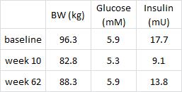
These data confirm my critique in point #2 (above), i.e., the subjects were not weight stable.  Their pre-diabetic state (glucose ~5.9) was fully recovered, albeit at a lower body weight (88.3 vs. 96.3 kg).  This is not a good thing.  If the subjects were stable at a reduced body weight, then their fasting glucose would have remained low.  Actually, I think these data support the yo-yo dieting theory; these subjects will be more insulin resistant when they returned to their normal body weight than they were at the beginning of the study… Indeed, I predict their fasting insulin will exceed 17.7 mU and glucose 5.9 mM when their body weight [inevitably] fully recovers, unfortunately.

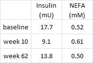
Interesting finding #2, it doesn’t look like adipose insulin sensitivity was really affected by the intervention:


Non-esterified fatty acids (plasma free fatty acid levels, “NEFA”) moved inversely with insulin, to a tee.  This probably supports the notion that adipose insulin sensitivity is normal in obese subjects prior to diabetes.  And these were obese but otherwise relatively healthy subjects, probably nowhere near frank diabetes.

Here is where the author’s data interpretation starts to go off-the-wall.


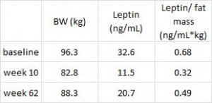
Leptin is secreted from fat cells to signal the brain that energy stores are full.  The authors claim leptin, an appetite-suppressing hormone, is still excessively reduced in the weight-reduced 1 full year after weight loss.  This is would be predicted to elevate hunger levels and drive weight regain.  The media buzz jumped all over this, in agreement with the author’s own interpretation, and said this is one of the reasons why so many dieters fail.  However, I would argue that 1) leptin was highest at baseline (when fat mass was the highest), 2) leptin was lowest at week 10 (when fat mass was lowest), and 3) leptin was intermediate at week 62 (when fat mass was intermediate).  Thus, leptin was properly regulated.  Furthermore, as leptin is correlated with fat mass, leptin shouldn’t return to baseline levels until fat mass returns to baseline levels.  Leptin 101.  They should be experiencing an intermediate level of hunger at week 62.

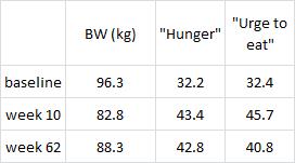
But alas, this is not happening.  The authors performed a battery of psychological tests to assess post-weight loss appetite.  Although psychology is not my forte, these data seem straight forward and extremely important:


“Hunger” is increased by week 10, exactly as expected for subjects that just lost 14% of their body weight in 10 weeks on a semi-starvation diet.  But even after they’ve regained half of the lost weight, they’re still just as hungry.  And the “urge to eat” is even starting to decline.  So it appears that they are adapting quite well.  Extremely well, in fact.  They spent 20 years overeating to maintain a huge amount of excess fat mass and in 1 short year their appetite is already starting to adjust to match their lower body weight.

The lower leptin levels immediately after weight loss, at week 10, reflect the starvation response and most likely had something to do with their increased hunger levels.  But the authors noted there was no correlation between hunger and the degree to which leptin declined.  In other words, if two people both lost exactly 14% of their body weight, and one person’s leptin dropped half more than the other, they weren’t half hungrier, meaning leptin isn’t exactly related to appetite.  Furthermore, and of utter importance, leptin levels didn’t correlate with weight regain; people who were hungrier were no more likely than anyone else to regain weight.  Everybody gets hungry after they lose weight; they are not more or less disadvantaged than others because of dysregulated hormones- the hormones and hunger responses were intact.  They may have even been adjusting to facilitate maintenance of a lower body weight, but this is not a “cool” conclusion, so it wasn’t entertained by the authors and certainly not by the media.

A speculative pearl: perhaps the markedly less hunger than expected based on the lower leptin levels is due, in part, to the lower insulin and free fatty acids.  These subjects were tapping into their stored fat, which may have compensated for the reduced energy intake.

I’m not saying that a 210 pound person can eat just as much as a 180 pound person if they too want to weigh 180 pounds.  No, depending on how fast they want to lose weight, they might need to eat less or markedly differently from their current diet.  But to consider that a disadvantage is backwards.  For a person to go from 180 to 210 pounds they ate more than a 210 pound person (it takes a lot of additional energy to lay down all that excess fat mass! … a lot of it just burns off).  Is that an advantage?  It is as much of an advantage as the disadvantage of a lower metabolic rate in weight-reduced people.  The data simply don’t tell a sad story about how hard it is to lose weight, they tell a clear story about energy balance.  The efficiency of investing excess energy from overeating in fat mass is matched during weight loss. It might not be “easy,” but the deck isn’t unfairly stacked.  They regained weight not because they were hormonally hungrier, they most likely regained it for the same reason they had it in the first place.


calories proper


pizza on the docket

they’re all crooks!

or

a slice of pizza does not count as a serving of vegetables. Period.

not the worst thing for you, really just a bunch of empty calories.  definitely NOT a serving of vegetables.

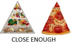
The government-sponsored school lunch program is designed to provide nutrition and improve the health of our children.  And they get around 11 billion dollars (i.e., $11,000,000,000) every year to do so.  Due to the recent surge in obesity, Congress acted fast!  School lunch programs do not closely follow the dietary guidelines.  To us taxpaying voters, $11,000,000,000 of our taxes are being wasted AND our kids are suffering.   Therefore, Congress quickly changed the status of pizza to “vegetable.”  Many schools serve pizza, and thus are now more closely in line with the dietary guidelines; so our taxes are being less-wasted and our children are healthier because they are eating more vegetables! To be clear: now that pizza is a vegetable, your children are healthier.

You can’t make this shit up – it is what happens when government gets involved in nutrition.  Please, ignore the Dietary Guidelines, they are horribly misguided.  And be extremely wary of electing anyone who wants to control nutrition; or vote with your dollars, don’t buy processed food!  The message is almost always wrong and both our bank accounts and our health suffer the consequences.  I would suggest supporting nutrition education programs, but NOT IF THEY SAY PIZZA IS A VEGETABLE.  If anything, a slice of pizza should count as dessert plus 3 servings of grains :/

Isn’t it bad enough that French fries, or crisps, count as vegetables?

Admittedly, claiming “the Dietary Guidelines are horribly misguided” is a strong statement, especially when said guidelines direct how a portion of our taxes are spent AND which foods are made available to our children.  This is important.


calories proper


Become a Patron!


Save

Prelude to a crossover, part deux

Prelude to a crossover, part deux

The anatomy of a washout, for better or worse.


In blue represents the baseline data.  On the left are the subjects and their body weight prior to randomization.  At baseline in phase I, we can see that the randomization wasn’t perfect, but that doesn’t really matter so much because this is a CROSSOVER study.  Note the group who is assigned to receive active drug first weighs slightly less than those assigned to placebo (98 vs. 102 kg).

The drug causes a 10 kg weight loss and there is no relevant placebo effect.

After a treatment-appropriate washout period, we are back again at baseline but this time for phase II.  Note the body weight of subjects 1-3 at the end of phase I (89, 88, and 87 kg) has returned to normal.  Now subjects 4-6 get the active treatment and experience a similar outcome.  The final summary appears in the column on the right: even though randomization at baseline was imperfect, the differences were crushed by the superiority of the crossover design, and we see the true drug effect regardless of whether we are comparing drug to baseline OR drug to placebo.  Voila, Mucho gusto, and Kudos


Take II.

Everything from baseline until the end of phase I is identical to the above example.  BUT the washout period is inadequate and the group who received active drug during phase I (subjects 1-3) has not returned to baseline and thus exhibits treatment-specific spillover effects.  Subjects 1-3 are at an artificially lower body weight for the baseline measurements of phase II, so the total baseline data are reduced (97.5 kg vs. 100 kg).  Now we get a different answer if we compare drug to baseline or drug to placebo.  This example illustrates one small error, but it is grievous.  Larger errors are made, and they are worse.  at one end of the spectrum, livelihoods and intellectual progress depend on the accuracy of these data.  be prescribed a sub-optimal medication, prescribe a wrong medication, waste time, etc., etc.  failing to account for a particular confounding variable and carelessly (or otherwise) using an improper statistical technique are two very different errs.  (end soapbox diatribe).


calories proper
 

QLSCD II (or Grains IV)

WRT the Quebec Longitudinal Study of Child Development (QLSCD), I failed to adequately emphasize one major implication of their findings.  It is a point that completely and wholly illustrates the disconnect from data, empirical science, and all common sense exhibited by mainstream beliefs in calories and dieting.   gravitas

Higher intakes of energy and grain products at 4 years of age are associated with being overweight at 6 years of age (Dubois, Porcherie et al., 2011 Journal of Nutrition)

Divide and conquer

Exhibit A


The table above shows the percentage of underweight, normal weight, and overweight children consuming the recommended number of servings for each food group.  15.5% of underweight children, 19.1% of normal weight children, and 42.6% of overweight children meet the recommended ?5 servings of grains per day.  Grains comprise [sic]: “breads, pastas, cereals, rice, and other grains”

There is a direct relationship between body weight and the percentage of children consuming ?5 servings of grains per day, i.e., more grains equals greater chance of being overweight.

Exhibit B


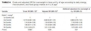
This table shows the odds for being overweight at 6 years of age in increasing quintiles of how many calories consumed daily two years earlier.  The crude odds risk (first column) shows a poor relationship between calorie intake at 4 years old and risk of being overweight 2 years later.  I say “poor” because the risk is non-significantly lower in the second quintile, higher in the third, lower in the fourth, but much higher in the fifth quintile (3.15x more likely to be overweight for the biggest eaters compared to the littlest eaters).  These data are unadjusted and could be confounded by a variety of factors.  Thus, the significance level of the trend is high p=0.0007.

The second column is similar to the first, but is adjusted for many known confounders: birth weight, physical activity, mother’s smoking status during pregnancy, annual household income, and number of above normal weight parents.  As such, the degree of statistical significance was reduced from 0.0007 to 0.001.

The third and most important column is further adjusted for body weight at 4 years of age, and shows that calorie intake is no longer associated with body weight at 6 years of age.  In other words, being overweight at 4 years old predicted being overweight at 6 years old better than calorie intake (and physical activity).

In the authors’ own words [sic]: “The only food group significantly related to overweight was grains.”  No association was observed for overweight risk with vegetables and fruits, milk products, or meat and alternatives.

IMHO, the observation that being overweight at 4 years old was the best predictor for being overweight 2 years later is remarkable… body weight status at 4 years old is a more important risk factor than both physical activity and calorie intake.  The only ‘controllable’ variable  is grains; i.e., you can’t change whether or not your child was overweight at 4 years of age, and physical activity and calorie intake doesn’t matter.  But grain consumption seems to matter, and it is something that can be controlled.

What is it about grains?  I don’t know, exactly, but it’s not simply that they’re carbohydrates because elevated carbohydrate intake didn’t increase risk for being overweight.

Exhibit C


“Eating less and moving more” is not the answer.  Nutrition matters, not the guidelines.


calories proper


Prelude to a crossover study I

A well-designed but poorly executed crossover study is always lamentable, but never so much as when it was intending to test an interesting hypothesis, in a human population.

Enter: the crossover study.

IMHO, a crossover is the superior human study design.  When properly executed, crossover study data are straight-forward, lack confounding, and the interpretation benefits from a reductionist simplicity that approaches that of an animal study.

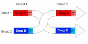
In brief, a cohort is randomly divided into two subgroups, half receive active drug and half get placebo for the first treatment period, then after a brief washout the groups switch and receive the opposite treatment.

The subjects never know if they are receiving active drug or placebo, which prevents the placebo effect, but more importantly each subject actually receives both treatments, active drug and placebo.  So we get to compare how they respond to drug with how they respond to placebo.  Although it is expensive and labor intensive, the crossover study design provides great statistical power with a relatively small sample size.  I am far more likely to accept crossover data at face value, because given a treatment-appropriate washout period, confounders are negligible.

With less brevity, as seen in the table below, a simple crossover study consists of two treatment phases divided by a washout period.


The most important, critical times to acquire data are

1)      Baselines: immediately prior to phase I (1a and 1b) and II (1c and 1d).  1a and 1b are averaged together because they represent baseline subject characteristics before any treatment.  Importantly, after the washout period time points 1c and 1d represent an identical scenario and are included as baseline subject characteristics.  E.g., baseline characteristics for subject 1 will be an average of measurements made at time points 1a and 1c.  The same goes for subjects 2-10, and all these values are averaged together and represent the baseline.  IOW, there is ONE set of baseline data that includes EVERYONE.

2)      Active drug finals: data taken immediately following active drug treatment periods (2a and 2d) are combined and represent drug effects.

3)      Placebo finals: data taken immediately following placebo treatment periods (2b and 2c) are combined and represent placebo effects.


The relevant comparisons are:

1)      Final values: active drug vs. placebo.  These are the most common and usually most relevant data reported.

2)      Final vs. baseline

  1. Placebo: any differences between the final placebo time points (2b and 2c) and baseline are bona fide placebo effects
  2. Drug: any differences between final drug time points (2a and 2d) and baseline roughly correlate with drug effects, but need to be compared with placebo effects to determine the relative contribution of each component.

A treatment-appropriate washout period is necessary to minimize any spillover effects.  For example, take a 100 kg subject in a weight loss trial who is randomized to receive active drug for phase I and loses 10 kg.  After phase I they will likely regain the lost weight, and this should be complete prior to phase II.  If not, baseline body weight will be artificially low, and the “placebo effect” will appear to be weight gain, enhancing the apparent benefits of the weight loss treatment in question.  The effects of improper washout periods are difficult to predict, but clearly don’t improve accuracy.  To further the point with an exaggerated extreme example: a drug that does nothing would look great against a placebo that caused weight gain.

In conclusion, it’s hard to mess up a crossover study short of grievous errors, but they happen.  Alternatively, some treatment effects may be attenuated by a rigorously designed and executed crossover study, but they are rarely exaggerated, which I believe is the better side with which to err.


calories proper


Grains III

Grains, gluten, and kids.  And I go WAY overboard on Table 4.

This topic has special relevance because grains provide more calories (31%) than any other food group.  And they are probably the most detrimental.

Higher intakes of energy and grain products at 4 years of age are associated with being overweight at 6 years of age (Dubois, Porcherie et al., 2011 Journal of Nutrition)

The Quebec Longitudinal Study of Child Development (QLSCD) assessed food intake and lifestyle variables in ~1,000 Canadian kids born in 1998 for 2 years.  The data came primarily from mothers but also daycare attendants when necessary, and their method for assessing food intake was pretty good- “multiple-pass” 24-h dietary recall interviews conducted in the home, and they double-checked by re-questioning a huge subgroup (~50%!, kudos).

Methodological peculiarities:

1)      Food groups consisted of

  1. Grains (e.g., breads, pastas, cereals, rice, etc.)
  2. Fruits and vegetables
  3. Dairy
  4. Meat and alternatives (e.g., meat [duh], lentils, tofu, and peanut butter)

What is the rationale for grouping lentils, tofu, and peanut butter 1) together, and 2) with meat?  IOW, data regarding the consumption of “meat and alternatives” will be difficult to interpret.

2)      Divisions between underweight, normal weight, and overweight were based on percentiles as opposed to absolute values.  For adults, BMI<20 = underweight, 20-25 = normal weight, 25-30 = overweight, and >30 = obese, regardless of the weight of their friends, colleagues, and neighbors.  By using percentiles: if the entire cohort is heavier than average, then overweight kids will be classified as normal weight because they are “normal” relative to the rest of the kids in the study, who are heavier than average.  So it’s not a debilitating methodological peculiarity, it just changes the definitions with which we are accustomed… so when they start out their results by stating [sic]: “20% of the children were overweight,” it doesn’t mean they have an unusually lean cohort, it actually tells us nothing.

Divide and conquer

Here’s what these kids were eating, in total and broken down by body weight groups:


Heavier kids ate more carbohydrates and less fat, and protein intake was relatively constant.  No big surprises, except that none of this reached statistical significance despite being true across all three quintiles… the lack of statistical significance is most likely due to the small sample size, and I suppose we’ve been spoiled lately with studies that included much larger subjects.  FTR, the carbs and fat data are probably the most relevant finding WRT feeding your kids.

Table 2 showed macronutrients and total energy, while Table 3 shows the breakdown by food groups (see Methodological Pecularity #2 above).


THIS is troubling.  Grain consumption is highly adherent to the guidelines, but the more the guidelines were adhered to, the fatter the kids got.  Combined with the amount of calories grains contribute to overall energy intake, this provides a fairly clear explanation for the childhood obesity epidemic.  IOW, these data strongly suggest the guidelines are wrong.

The long-awaited Table 4.  (did you feel the suspense?)


This table shows the odds for being overweight in increasing quintiles of total calorie intake.  The first and second columns show what everyone normally expects: more calories consumed = more chance of being overweight.  And it’s highly statistically significant.  But here’s the kicker: the third column adjusts for body weight at 4 years of age and the association is abolished.  !!!  That means being fat at 4 years old was a more important predictor of being fat at 6 years old than calorie intake.  Chubby 6 year olds were overweight because they were chubby when they 4 years old, NOT because they ate too much !  Excessive inactivity is ruled out because these data were adjusted for physical activity.

“Eating less and moving more” is not the answer.  Nutrition matters.  Don’t feed your kids grains, regardless of the guidelines.


calories proper


really?

REALLY??

REALLY?