Monthly Archives: March 2011

Orlistat blog

Orlistat blog.

This post is a little long, but the conclusion was bold enough to warrant inclusion of enough studies to independently demonstrate each point.   Reducing calorie and dietary fat intake will help weight loss, but it’s not the only way.  The goal for this blog entry is to compare the results from studies on Orlistat, which pharmacologically inhibits dietary fat digestion, with the results from low fat and low carb diet studies.  In brief, yes, reducing dietary fat and calories pharmacologically via Orlistat or voluntarily via low fat diet causes weight loss, but the metabolic improvements that are usually associated with weight loss are considerably attenuated because of the reduced dietary fat.  IOW, for any given amount of weight loss, the metabolic improvements are greater for a diet that restricts carbohydrates (sugars, whole grains, refined grains, cereal fibre, etc.) than for a diet or drug that restricts fats (e.g., low-fat diet, Orlistat, etc.).

Note: Orlistat is biologically similar to a low fat diet.  With the low fat diet, dietary fat intake is reduced voluntarily; with Orlistat, dietary fat digestion is reduced pharmacologically.  With both, the amount of dietary fat that gets into the body is reduced.

These studies are relatively similar in study design, subject population, duration, and how the interventions were administered.  They all lasted at least one year, except the Yancy study, which was only 48 weeks but had to be included because it makes an important connection.

Orlistat (low fat) studies: Krempf, 18 months; Hauptman, 24 months.   Low carb vs. low fat: Stern, 12 months; Foster, 12 months.  Low carb vs. Orlistat: Yancy: 48 weeks.

Round 1. Orlistat vs. Placebo

Weight reduction and long-term maintenance after 18 months treatment with orlistat for obesity. (Krempf et al., 2003 International Journal of Obesity Related Metabolic Disorders)

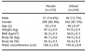
700 obese subjects, baseline characteristics:

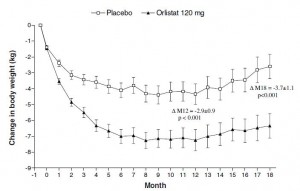
As expected, impressive weight loss in the Orlistat group:

Orlistat group lost 8% of their initial body weight, compared to 3% in the placebo group… Orlistat weight loss was 2.5x greater than placebo.

Important numbers: (Placebo vs. Orlistat)

Fasting glucose: -0.29 mM vs. -0.86 mM

HDL: +31.5% vs. +38.2%

TG: -15.6% vs. -24.4%


Orlistat in the long-term treatment of obesity in primary care settings. (Hauptman et al., 2000 Archives of Family Medicine)

Same basic outline as Krempf study (above). 600+ obese subjects, baseline characteristics:

results:

To compare directly with the Krempf study: by week 76 (18 months), Orlistat group lost 7% of their initial body weight compared to 3% in placebo, just over twice as much.  To compare with the rest of the data in this study: by week 104 (24 months), Orlistat group lost 5% of their initial body weight compared to 2% in placebo.  Orlistat group lost 2.5x more weight than placebo.

Important numbers: (placebo vs. 120 mg Orlistat [dose used by Krempf])

Fasting glucose: +0.24 vs. +0.16 (yes, fasting glucose actually increased in the Orlistat group)

HDL: +7.7 vs. +5.8%  (yes, HDL improved more in the placebo group compared to Orlistat)

TG: -3.0% vs. +13.5% (yes, TGs actually increased in the Orlistat group)


Round II. low carb vs. low fat.

The effects of low-carbohydrate versus conventional weight loss diets in severely obese adults: one-year follow-up of a randomized trial. (Stern et al., 2004 Annals of Internal Medicine)

Weight loss:

Low fat dieters lost 2% of their initial body weight, and low carb dieters lost 4%.  Although this study was shorter (1 year, compared to 1.5 years in Krempf and 2 years in Hauptman).

Important numbers: (Low fat vs. low carb)

Fasting glucose: -1.11 vs. -1.55

HDL: -12.3% vs. -1.9%

TG: +2.7% vs. -28.2%


http://www.ncbi.nlm.nih.gov/pubmed/12761365

A randomized trial of a low-carbohydrate diet for obesity. (Foster et al., 2003 NEJM)

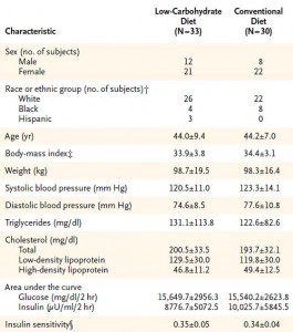
Baseline characteristics:

Weight loss:

and the data:

Important numbers: (Low carb vs. low fat)

Fasting glucose: ?

HDL: +11% vs. +6.0%

TG: -17% vs. -0.7%


Round III. Low carb diet vs. Orlistat

A randomized trial of a low-carbohydrate diet vs orlistat plus a low-fat diet for weight loss. (Yancy et al., 2010 Archives of Internal Medicine)

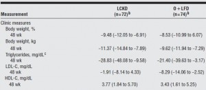
This study actually pitted a calorie unrestricted low carb diet directly against Orlistat.  Over 100 subjects were included, the details are in line with the above studies.

Body weight: Low carb group, 124 kg -> 113 kg, they lost 9 % of their initial body weight; Orlistat, 119 kg -> 109 kg, they lost 8 % of their initial body weight

Important numbers: (Low carb vs. Orlistat)

Body weight:   -9.2%   vs. -8.1%

Fasting glc:      -9.74    vs. -3.26

HDL:                +10.3% vs. +8.7%

TG:                   -19%    vs. -15.7%


Summary

Krempf:           placebo vs. Orlistat

Body weight:   -3%      vs. -8%

Fasting glc:      -0.29    vs. -0.86

HDL:                +32%   vs. +38%

TG:                   -16%    vs. -24%


Hauptman:      placebo vs. Orlistat

Body weight:   -2%      vs. -5%

Fasting glc:      +0.24   vs. +0.16

HDL:                +7.7     vs. +5.8%

TG:                   -3.0%   vs. +13.5%


Stern:               low fat vs. low carb

Body weight:   -2%      vs. -4%

Fasting glc:      -1.11    vs. -1.55

HDL:                -12.3% vs. -1.9%

TG:                   +2.7%  vs. -28.2%


Foster:             low fat vs. low carb

Body weight:   -3%      vs. -4%

Fasting glucose: ?

HDL:                +6%     vs. +11.0%

TG:                   -0.7%   vs. -17%


Yancy:              low carb vs. Orlistat

Body weight:   -9.2%   vs. -8.1%

Fasting glc:      -9.74    vs. -3.26

HDL:                +10.3% vs. +8.7%

TG:                   -19%    vs. -15.7%

1. In the Krempf Orlistat study, Orlistat caused more weight loss than placebo, and was modestly better at reducing fasting glucose and TGs and increasing HDL.

2. In the Hauptman Orlistat study, Orlistat caused more weight loss but fasting glucose actually increased relative to baseline, the increase in HDL was less than in placebo, and TGs actually increased relative to baseline and placebo.

3. In the Stern low carb study, the low carb diet caused more weight loss than the low fat diet, and the low carb diet lowered fasting glucose modestly better than low fat diet.  Changes in HDL and TGs were significantly better in the low carb group.

4. In the Foster low carb study, the low carb group lost modestly more weight than the low fat group, and the changes in HDL and TG were significantly better in the low carb group as well.

5. In the Yancy low carb vs. Orlistat study, the low carb group lost modestly more weight, fasting glucose decreased almost twice as much in the low carb group, and HDL and TG improved significantly more in low carb relative to Orlistat.


Reducing body weight by cutting calories and reducing fat intake (via Orlistat [Krempf, Hauptman, Yancy] or low fat diet [Orlistat studies, Stern, Foster]) consistently produces inferior changes in the metabolic landscape compared to reducing carbohydrate intake (Stern, Foster, & Yancy).  Orlistat caused more weight loss compared to placebo (Krempf, Hauptman), but not compared to a low carb diet (Yancy).

Dietary fat increases HDL.  Replacing carbs with dietary fat reduces TGs.  These things occur independently from weight loss, although weight loss is greater on a low carb diet compared to a low fat diet.   IOW, reducing carb intake causes more weight loss and superior changes in risk factor profiles compared to reducing calorie and fat intake regardless of whether fat is reduced via dieting (low fat diet) or pharmacologically (Orlistat).

For full access to all articles and much more (or if you just like what I do and want to support it), become a Patron! Five bucks a month and there are many other options. It’s ad-free and you can cancel if it sucks ????

Also, I’m open to suggestions so feel free to leave a comment or email me directly at drlagakos@gmail.com.

Affiliate discounts: if you’re still looking for a pair of hot blue blockers, Carbonshade is offering 15% off with the coupon code LAGAKOS and Spectra479 is offering 15% off HERETrueDark is running a pretty big sale HEREIf you have no idea what I’m talking about, read this then this.

20% off some delish stocks and broths from Kettle and Fire HERE

If you want the benefits of  ‘shrooms but don’t like eating them, Real Mushrooms makes great extracts. 10% off with coupon code LAGAKOS. I recommend Lion’s Mane for the brain and Reishi for everything else.

calories proper


Become a Patron!


Save

GB Grains blog, take II

GB Grains blog, take II

The effect of increasing consumption of pulses and wholegrains in obese people: a randomized controlled trial. (Venn et al., 2010 JACN)

I like this study because of its thorough dietary intervention.  The researchers provided a lot of the food, had frequent meetings, checkups, and dietary counseling sessions.  They even sponsored cooking lessons and supermarket tours!  Those are all definitely strengths, in addition to the ultra-long study duration of 18 months.  Both groups were advised to eat low fat diets, but the intervention group was specifically instructed to eat more whole grains.  To supplement their diets, the intervention group was given rolled oats and rye, wholemeal flour breads, etc., while the control group received cornflakes, cans of fruits & vegetables, refined grain breads, etc.

How’d they do?  As seen in figure 1 (below), the diet was followed quite well.

Figure 1.  Everybody tried to eat healthier in this study, so whole grains increased in both groups.  But it was significantly higher for most of the time in the intervention group.  Everybody also ate fewer calories.  And since whole grains are both carbohydrates and fibrous, consumption of these increased in both groups, but more so in the intervention group.

To make a long story short, both groups lost approximately equal amounts of weight with the treatment group losing slightly more than control.  The interesting thing is that we would have expected these weight losses to be accompanied by all-around improvements in health.  But they weren’t (reminiscent of the Orlistat trials).  Fasting glucose is a surrogate for insulin sensitivity.  Fasting glucose increased in both groups:

Figure 2. Metabolic outcomes.

Both groups lost weight.  Dietary carbohydrates are linked with insulin resistance, and although the % of calories from carbohydrates increased in both groups, the absolute amount decreased because of the large reduction in calories.  So they were eating fewer grams of carbohydrates and losing weight… So WHY did blood glucose increase?  I’d be willing to bet whole grains had something to do with it.  Whole grains increased significantly in both groups.  There’s something creepy about whole grains, like how every correlation between them and good health is attenuated after adjusting for confounding lifestyle and dietary factors.  Healthy people eat whole grains, but whole grains don’t healthify.  Possible suspects include lectins and gluten.

Just like DART, the Venn study was a randomized controlled intervention study, which is very powerful study design.

However the Venn study was a weight loss study, which is very different from free-living individuals eating ad libitum in ‘energy balance.’

Enter: the Jiangsu Nutrition Studies.  These epidemiological observational studies have been going on for a while and their goal is to identify dietary patterns that are associated with weight gain.

disclaimer: in general, when coming upon a study of “dietary patterns” I turn around and run away.  The data are usually so manipulated that they no longer reflect what a person actually eats.  I’m making an exception here because Jiangsu  demonstrates an interesting point.  Briefly, they were able to differentiate “diets devoid of whole grains” from “diets rich in whole grains,” and two other dietary patterns that couldn’t be characterized by their whole grain content.

Vegetable-rich food pattern is related to obesity in China. (Shi et al, 2008 International Journal of Obesity)

Dietary pattern and weight change in a 5-year follow-up among Chinese adults: results from the Jiangsu Nutrition Study. (Shi et al., 2010 British Journal of Nutrition)

They somewhat humorously defined four major dietary patterns:

Divide and conquer.


Table 1.  Dietary patterns.  Focus on the foods with the biggest “Factor loading,” as these are the most important foods that define each pattern.  In the traditional diet, for example, presence of rice (0.78) and absence of wheat flour (-0.75) http://en.wikipedia.org/wiki/Wheat_flour are the two most important factors that distinguish the traditional dietary pattern.  Presence of whole grains (0.56) is what most defines the vegetable-rich pattern.  Those are the two I think are of most interest: traditional dietary pattern is defined by an absence of wheat flour, while the vegetable-rich diet is defined by an abundance of whole grains.

In 2002, the food intake data were collected and analyzed.  For each dietary pattern, subjects are divided into quartiles based on their adherence to each respective dietary pattern.  IOW, every subject is ranked on their adherence to each dietary pattern.  For example, you might rank very high for macho, intermediate for vegetable-rich, and low for traditional and sweet tooth. You are ranked by your adherence to each dietary pattern.

To analyze the effect of a dietary pattern on a specific health parameter, investigators compare the prevalence of that parameter outcome across quartiles of each dietary pattern.  If there is no association between a specific dietary pattern and the health parameter, it would be similar across quartiles.  If, OOTH, the parameter increases or decreases across all 4 quartiles, then there is a correlation.

At baseline (2002) and follow-up (2007), the subjects were weighed.  The figure below depicts weight change between 2002 and 2007 and is divided into quartiles of each dietary pattern.

5-year weight change across quartiles of each dietary pattern.  Can you spot which two of the four dietary patterns were significantly associated with weight change?


Traditional diet, defined by the absence of wheat flour (top left).  People who were the most adherent to the traditional diet (“Q4”), meaning they never touched wheat flour, gained the least amount of weight over those 5 years.  Conversely, people who were the least adherent to the traditional diet (“Q1”), i.e., those who ate the most wheat flour, gained the most weight over those 5 years (~2.0 kg).

Vegetable-rich diet, defined by an abundance of whole grains (bottom right).  People who were the most adherent to the vegetable-rich diet, meaning they ate plenty of whole grains, gained the most weight over those 5 years (“Q4,” 1.6 kg).  Conversely, people who ate the least whole grains gained the least weight over those 5 years (“Q1,” 0.4 kg).

It gets worse.

The prevalence of frank obesity (BMI > 30) according to adherence to the vegetable-rich (high whole grains) diet:

Obesity is far more prevalent among those consuming the most whole grains compared to the least.  To make a stretch, people who ate the most whole grains were twice as likely to be obese (bottom row, first [6.9] compared to fourth [15.0] quartile).

Whole grains are associated with frank obesity in the total population, but they are really really associated with obesity in folks between 31 and 45 years of age:

People aged 31-45 with the highest intake of whole grains were 3.66x more likely to be obese than people with the lowest.

The Jiangsu Nutrition studies are observational, but prospective.  The Venn study (above) and DART are randomized intervention trials.  Obesity (Jiangsu), elevated fasting glucose despite weight loss (Venn), and all-cause mortality (DART)… Collectively, these findings suggest that whole grains should be abandoned, or at least demoted to “consume sparingly.”  But their elite status among dietitians and health advocates prohibits this.  Divide and conquer?


calories proper


Become a Patron!


Fish blog, take I

Fish blog, take I

Eat fish people.  No, don’t eat “fishpeople,” … nevermind.  I am a strong proponent of eating salmon so this blog was created to figure out which is the best kind to eat.  Priorities are 1) least toxins and 2) best fatty acid composition.

Round 1. Metals in salmon: Farmed vs. wild

A survey of metals in tissues of farmed Atlantic and wild Pacific salmon (Foran et al., 2004)

Farmed Atlantic salmon were sourced from North American commercial suppliers and included salmon from British Columbia, Chile, Maine, and Norway.  They got 10 fish from 3 different suppliers in each region: 4 regions x 3 suppliers/region x 10 fish = 120 fish. Species: Farmed Atlantic (didn’t realize that was a species…  this is one of those “a-duh” moments).

Wild salmon were from suppliers in Alaska, British Columbia, and Washington for a total of 6 batches of 10 fish.  Species: chum & coho.

Methods: BORing

Results:

Divide and conquer.

The amount of metals in Farmed Atlantic (filled bars) and wild salmon (open bars):

Co, cobalt; Cu, copper; Sr, strontium; Cd, cadmium; Pb, lead; U, uranium; As, arsenic; MeHg, methylmercury.

The authors noted some statistically significant differences in cobalt, copper, cadmium (all modestly higher in wild salmon), and the nontoxic “organic” arsenic (higher in farmed salmon), but while those differences may be significant statistically, they don’t look significant physiologically.  (if the authors wanted to make the differences look bigger, perhaps they should have opted for a linear ordinate; or maybe they just wanted to squeeze everything in one figure instead).  Interestingly, similar levels of these metals were found regardless of where the salmon came from.  I would’ve imagined a Farmed Atlantic salmon from Norway would be vastly different than a Farmed Atlantic from British Columbia.  Guess not.

As expected, mercury content was correlated with body size (higher up on the food chain, more mercury accumulation), but this is pretty much meaningless to the consumer because we have no idea of the fish’s weight when it was intact.  IOW, the salmon on the bottom (figure below) would have less mercury than the one on the top,

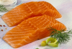
But I have no way of knowing who these came from (salmon fillets):

Fortunately, salmon is a relatively “clean” fish, so it doesn’t really matter.

Back to the data.

Oddly, the authors noted that wild salmon were longer than Farmed Atlantic, but mercury content didn’t correlate with length, only body size (fatness? muscularity? weird).

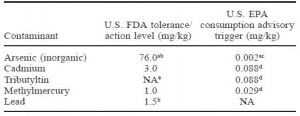
acceptable levels for metals in fish:

Fig 2


Farmed Atlantic and wild (Coho & Chum) salmon were equivalent and well beneath both the FDA and the far more stringent EPA’s limits.  On a side note, I learned that the FDA allows a higher amount of contaminants because they are talking about exposure to each contaminant individually.  The EPA is stricter because they are taking into consideration the fact that we are exposed to multiple contaminants simultaneously (“toxic world,” and all that jazz).  For example, you would be safe consuming a fish with 76.0 mg/kg inorganic arsenic if that were the only toxin to which you were exposed.  But when multiple toxins are present, as they most likely are in our diet, the cutoff for inorganic arsenic is set at 0.002 mg/kg.  The FDA allows 38,000 times more inorganic arsenic than the EPA; that seems grievously negligent but in reality, the amount in commercial fish is significantly lower.  It’s like saying you must be at least 2 inches tall, by the EPA’s standards, or 5 inches tall, by the FDA’s standards, to go on a rollercoaster ride.

One last note: the limit for methylmercury consumption is ~0.4 ug/kg/d, which is approximately 28 ug/d (for a 70 kg or 154 lb person).  Even the most toxic salmon has methylmercury  <100 ug/kg, meaning you can safely eat ~300 grams (10 ounces or about 3 servings) of salmon per day.


Round 2. Pesticides: Farmed vs. wild salmon

Global Assessment of Organic Contaminants in Farmed Salmon (Hites et al., 2004 Science)

These researcher went big-time, 700 fish! (appr. 1 ton of salmon)

Sources:

  1. Farmed Atlantic salmon: 8 major commercial suppliers.
  2. Wild Pacific salmon: chum, coho, chinook, pink, & sockeye from 3 different regions
  3. My personal favorite: Farmed Atlantic salmon fillets purchased by undercover secret agents in 16 cities in North America and Europe (Boston, Chicago, Denver, Edinburgh, Frankfurt, London, Los Angeles, New Orleans, New York, Oslo, Paris, San Francisco, Seattle, Toronto, Vancouver, and Washington DC.)
  4. They even analyzed samples of fish food covering over 80% of the global supply

Side note: even if your exact city or region isn’t on this list, I suspect the conclusions can be reasonably applied to just about everywhere.

Results:

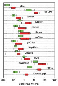
Fig 3


Figure 3. Contaminants present in Farmed (red) or wild (green) salmon.  It looks like for every contaminant Farmed and wild are similar, but Farmed always has a little more (beware of the deceptive log scale)

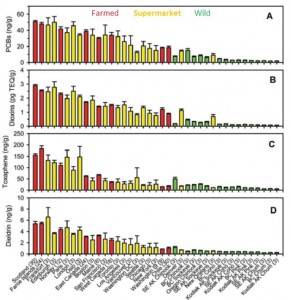
Fig 4


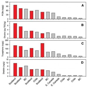
This figure is very busy.  Concentration of contaminants in Farmed (red), supermarket Farmed Atlantic fillets (yellow), and wild (green) salmon.  Focus on the cities listed at the bottom: the ones toward the left (Europe) are ultra-toxic; the ones on the right (Pacific [Alaska]) are the most safe.  Conclusion from these data: Wild Pacific is safe, Farmed Atlantic is intermediate, and anything European is toxic.  Avoid Scottish salmon like the plague.  And microwave popcorn.

WRT farmed salmon, it looks like most of the problem is with the fish feed:

Figure 5.  Contaminants in fish feed.  European fish food is bunk (red bars).  Pacific (BC British Columbia, Chile) and Atlantic (E. Canada) fish foods are OK (both in gray bars).


Conclusions:

WRT metals (Foran study): no difference between Farmed Atlantic and wild Pacific

WRT contaminants (Hites study): wild Pacific (Alaska and British Columbia, also Chilean) is good, supermarket Farmed Atlantic fillets are OK, and European is bad.


Round 3.  Fatty acid composition as per www.NutritionData.com


Atlantic: Farmed vs. wild

Pacific coho: farmed vs. wild vs. silver Alaska native

Alaska: Silver native vs. King chinook


Total EPA + DHA:  1st place goes to farmed Atlantic: 1,966 mg EPA + DHA per 100 grams.  On average, farmed salmon contains more EPA + DHA than wild salmon.

2nd place goes to silver Alaska native coho: 1,876 mg EPA + DHA

3rd place goes to wild Atlantic 1,436 mg EPA + DHA

Lowest were: wild Pacific coho (1,085 mg), Alaska King Chinook (1,150 mg), and wild Pacific Sockeye (1,172 mg).  (all three are Pacific.)

-Farmed salmon has more EPA + DHA than wild salmon

-Atlantic salmon has more EPA + DHA than Pacific salmon

And there were even species-differences:  Alaskan Silver native coho (1,876 mg) had much higher EPA + DHA than Alaskan King Chinook (1,150 mg).

EPA/DHA ratio: not entirely sure about the significance of this, but perhaps EPA is slightly better for physical health while DHA is slightly better for mental health (?) (future blog post topic?)

Average 0.6 (all salmon have slightly more EPA than DHA).  Most EPA (highest EPA/DHA ratio): Farmed Atlantic & wild Pacific Sockeye (0.8).  Most DHA (lowest EPA/DHA ratio): wild Atlantic (0.3) & Silver Alaska native coho (0.4)


Conclusions:  WRT contaminants, wild Pacific seems best, farmed Atlantic is OK, and European is bad.

WRT EPA + DHA, Farmed Atlantic and silver Alaska native coho were best and wild Pacific was the lowest.  IMHO the benefits of DHA & EPA outweigh the malefits of contaminants because the dose of EPA + DHA in a serving of salmon is sufficient to reap many of the benefits of EPA & DHA, while the dose of contaminants is too low to cause harm.  Therefore I’m going to stick with Farmed Atlantic.  OOTH if silver Alaska native coho is similar to Kodiak salmon (which I think it is), then it has the lowest contaminants as per the Hites study and 2nd highest EPA DHA as per nutritiondata.

Winner: wild Pacific Kodiak or silver Alaska native coho

2nd place: Farmed Atlantic

Affiliate linksjoin Binance and get some cryptoassets or download Honeyminer and get some Bitcoins for free! And now you can mine Bitcoin from your Chromebook!

Still looking for a pair of hot blue blockers? Carbonshade and TrueDark are offering 15% off with the coupon code LAGAKOS and Spectra479 is offering 15% off HERE. If you have no idea what I’m talking about, read this then this.

20% off some delish stocks and broths from Kettle and Fire HERE

If you want the benefits of  ‘shrooms but don’t like eating them, Real Mushrooms makes great extracts. 10% off with coupon code LAGAKOS. I recommend Lion’s Mane for the brain and Reishi for everything else

Join Earn.com with this link.

Start your OWN Patreon campaign!

calories proper


GB Grains blog, take I

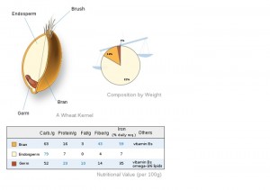
What are whole grains?  Short answer: grass seeds.  Long answer: see below.

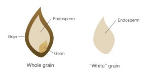
Grains are made of bran, germ, and endosperm.  Refined grains are endosperm only (GLUTEN and starch).

Germ is the embryo.  Bran is the shell, lots of fiber & vits.  Has unsaturated fatty acids which can go rancid so bran is removed to improve shelf life of refined grains.

Moving on to the data:

Round 1. Grains et al. vs. mortality

Effects of changes in fat, fish, and fibre intakes on death and myocardial reinfarction: Diet and reinfarction trial (DART) (Burr et al., 1989)

The Diet And Reinfarction Trial (DART) is one of the most historically important nutrition INTERVENTION studies.  Intervention studies are where investigators actually go into a population and ask them to change something about their diet; they are intended to determine causation and thus the best advice to give the target population.  The findings from DART, in particular, are crucial & too often ignored.

DART included ~2,000 men, ~56-57 years of age, who recently suffered a heart attack and the intervention was simple.  They were randomly assigned to receive one of three dietary recommendations:

  1. < 30% dietary fat
  2. > 2 servings of fatty fish per week
  3. > 18 grams of cereal fibre (whole grains)
  4. Control group, received no advice

If you’re dispensing nutrition information, then you are intervening just like these researchers.  It stands to reason that the recipients of your advice might respond similar to the DART subjects.  Pay attention.

Just like real patients, the DART population mostly did what they were supposed to.  The fat group decreased dietary fat intake from 35.3% to 32.1%.  The P/S ratio reflects the ratio of polyunsaturated to saturated fat.  The recommendation was to increase this ratio by either increasing polyunsaturated fat consumption or decreasing saturated fat consumption, which was accomplished.

The fish group increased their fish intake from less than one serving per week on average up to the recommended 2 servings (however, 14%-22% of the patients couldn’t tolerate fish and were allowed to take fish oil capsules instead).  The table is showing EPA as a proxy for fish intake; salmon has about 0.5 – 1 gram per serving.

And the fibre group doubled their cereal fibre (whole grains) intake from 9 up to 19 grams per day.

So remember three things: fat, salmon, and cereal fibre.

Gravitas (see below):

Divide and conquer.


10.9% of the men who were advised to decrease dietary fat intake died within 2 years while 11.1% who received no such advice died.  That is an absolute risk reduction of 0.2% and a relative risk reduction of 2%.

Absolute risk = 10.9% – 11.1% = -0.2%

Relative risk = (10.9% – 11.1%) / 10.9% = -2.0%


9.3% of men who ate more fish died compared to 12.8%!! That is an absolute risk reduction of 3.5% and a relative reduction of 27%.  27% reduced relative risk is huge.  Eat salmon.

Last but not least, 12.1% of men who increased their consumption of cereal fibre died while 9.9% who didn’t died.  IOW, increased cereal fibre caused a 2.2% increase in absolute risk and a 22% increase in relative risk.

In summary, reducing dietary fat had no effect on mortality.  Eating more salmon drastically reduced mortality.  And eating more cereal fibre increased mortality.  Cereal fibre is bad for you?

Cereal fibre comes from whole grains, which are different from other fibrous foods like broccoli and spinach.  Cereal fibre, and whole grains in general, are suspect.  These were men in their 50’s who had a heart attack, so the results may not apply to everyone, but there is another way to look at it.  The DART population had two immediately relevant risk factors: age and a cardiovascular event.  I propose cereal fibre may have been simply another insult to their health profile.  IOW, the mortality risk for increasing cereal fibre might be > 22% for a population with more than two risk factors and < 22% for a population with fewer risk factors. IOW, cereal fibre is bad but won’t kill a healthy person.  Indeed, we see this every day; many people who lead a healthy lifestyle consume whole grains and are fine.  Perhaps the whole grains aren’t what is making them healthy.

Another remarkable finding of this study was the effect of increasing fatty fish intake:

The survival curve: the life-saving effect of increased fish intake are almost instantaneous; by 3 months there is already a noticeable reduction in mortality in the fish group.  That is more substantial than what has been shown in any single trial of statin drugs.  Gravitas.

Summary of DART: Eat salmon, not grains.  And dietary fat doesn’t matter.


Support for the theory that whole grain consumption is simply a habit of healthy people, not what actually makes them healthy:

Whole grains, bran, and germ in relation to homocysteine and markers of glycemic control, lipids, and inflammation (Jensen et al., 2006 AJCN)

This paper includes data from the Health Professionals Follow-Up Study, a huge epidemiological study on food intake data and a variety of endpoints.  HPFS = >50,000, all male doctors, established circa 1986

Divide and conquer.

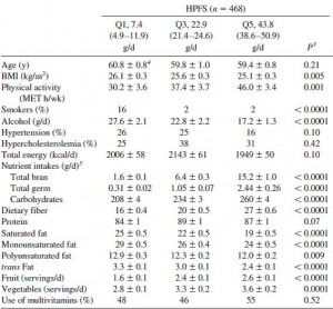
Table 1: lifestyle and dietary characteristics

The table above is divided into three columns.  On the right are people with low grain intake (4.9-11.9 g/d).  Middle is intermediate grain intake.  Rightmost column is high grain intake (38.6 – 50.9 g/d)

Healthy people eat a lot of whole grains (and exercise more, maintain a healthier body weight, smoke less, eat more fiber, eat less trans fats, and eat more vegetables).  All of those factors are directly correlated with the consumption of whole grains.  IOW, scientifically, this makes it very difficult to differentiate true health-promoting effects of grains because there are a lot of bona fide confounding factors.

For example:

1)      low insulin levels are good.

2)      People who eat a lot of grains are all-around healthy

3)      There is a good inverse correlation between grains and insulin level, suggesting that grains may actually be healthy and not something that is coincidentally ingested by healthy people; note the high degree of significance (“0.01,” red arrow)

BUT once the data are statistically corrected for confounding lifestyle factors such as smoking, body weight, and exercise, the association between grains and insulin gets weaker (“0.06,” middle row, red arrow)

And when the data are further corrected for confounding lifestyle and dietary factors such as vegetables and sugar, the association is no longer significant (“0.13,” bottom row, red arrow):

So in some cases, like with insulin, high grain intake is most likely a marker for a healthy person; the grains themselves aren’t what makes these people healthy, it is the lifestyle and dietary things that healthy people do.  In hindsight this shouldn’t have been too unexpected, because foods high in grains are carbohydrate-rich, after all, and carbohydrates drive insulin secretion.  So we shouldn’t be terribly surprised that higher carbohydrate consumption is not associated with lower insulin levels.

Moving on.

C-reactive protein (CRP) is a general marker of inflammation and an excellent marker for an assortment of morbidities and mortality… (IMHO CRP a better marker than LDL).

Note the similar trend: There is a strong correlation between CRP and grains (top row, last column, “0.03”).  But the correlation is weakened by controlling for lifestyle factors (middle row, “0.32”) and further weakened by controlling for diet (bottom row, “0.63”).  Thus, while someone who eats a lot of grains also has relatively low systemic inflammation, the grains are most likely not playing a causal role.

So where does this leave us?  The things that were true in 1989 and 2006 are probably still true today.  Eat salmon, not grains.  And fat doesn’t matter.

Will whole grains kill a healthy person?   No.

Whole-grain intake is inversely associated with the metabolic syndrome and mortality in older adults (Sahyoun et al., 2006 AJCN)

This was a population of >500 healthy people, 60-98 years of age, established circa 1981.

The usual suspects:

Same as above, people who eat more whole grains smoke & drink less, exercise more, eat less saturated fat; all things that are common amongst “healthy” people (but may or may not actually be what is making them healthy).

But to make a long story short:

Hey!! They are the only data I want shown!

This was a much smaller study, but supports the theory that grains may only be detrimental to people with more serious risk factors (like a previous cardiovascular event [e.g., heart attack, etc.]).

DART was an intervention study, and therefore was more powerful and meaningful. The other studies were observational.  Will you still recommend whole grains?


calories proper


Become a Patron!


BAT blog, take I

Brown adipose tissue (BAT) has classically been thought of as a thermogenic tissue in rodents, infants, and to a small degree in adults.  BAT is brown because of its rich vascular supply; it’s not a fat storage organ like it’s cousin white adipose tissue.  BAT burns fat and wastes the energy as heat.  Cold temperature activates BAT, which we know is true for humans

Cold-activated brown adipose tissue in healthy men (van Marken Lichtenbelt et al., 2009 NEJM)

BAT in humans, the dark areas represent regions of brown adipose tissue (BAT).

The characteristic of BAT introduced in this paper is that of a Hoover sucking lipids out of the blood, but instead of swirling around in the Windtunnel, they are disposed of into a region of space in which nothing, not even light, can escape (except maybe heat).  For those of you at home, this means if you spend the day swimming in a cold pool or the ocean and then consume a fat-rich meal, virtually all of the lipids will be diverted into BAT where much of their energy will be dissipated as heat.

Brown adipose tissue activity controls triglyceride clearance. (Bartelt et al., 2011 Nature Medicine)

This paper had such an astounding umph…

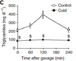
Below is the profile of plasma lipids from fasted mice at either room temperature (control) or after 24 hours at 4C (39F):

Figure 1a: mice at 22C or 4C.  Cold mice have much lower triacylglycerols (TGs) and moderately lower glycerol.

Problem #1.  Less glycerol generally means lower lipolysis; cold mice should have more glycerol because: cold -> sympathetic nervous system activation -> catecholamines -> lipolysis -> more glycerol and FFAs (?)

It’s so early in the post, but here is the gravitas.  The meat and potatoes.  Cold mice experience virtually no lipemic response to an oral bolus of 100uL olive oil.

I love the author’s choice of dollar signs to denote statistical significance.

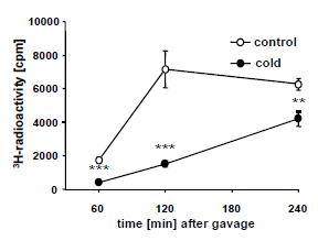
Problem #2.  3H-triolein was mixed in the olive oil, and accordingly plasma 3H rose in parallel with TG’s in control mice.  But plasma 3H also increased in cold mice despite no increase in TGs.

Plasma 3H mirrors TGs in control but not cold mice.

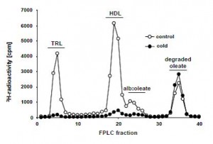
The lipid profile of plasma 3H 2 hours after the gavage is shown below (Figure s3)

In the controls (normal mice at room temperature, open circles), most of the 3H is recovered in TRLs (chylomicrons and VLDL) and HDL.  The only 3H recovered from the plasma of cold mice was in the flow-through.  For some reason the authors are calling this fraction “degraded oleate,” but in my experience everything that’s left in the sample dumps out together in the end, including free fatty acids. The authors claim this “degraded oleate” is comprised of partially oxidized (chain-shortened) 3H-fatty acids and 3H20, which it could be, but it could also be unmetabolized 3H-oleate.  More importantly, however, is that it was similar in both groups.  So the cold didn’t enhance the appearance of these mysterious 3H molecules.  IOW, there is still a lot of 3H unaccounted for…  So, where did it go?

Divide and conquer

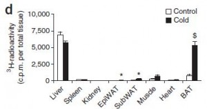
Figure 1e.  2 hours after the oral gavage, tissues were collected and checked for radioactivity

As expected, liver and muscle took up the most.  Liver should have a higher fractional uptake, but muscle takes up more overall simply because it is a much bigger organ….   Enter: BAT.

Problem #3.  Figure 1e is showing uptake per total tissue, and given the authors claim that both liver and BAT are of equal weight (1.4 grams), that is a ridiculously high fractional uptake in cold BAT.

Suspicions confirmed:  when expressed as fractional uptake, it is ridiculously high in BAT:

Figure s4: As expected, liver is higher than most tissues, except for BAT, which exhibits a phenomenally high fractional uptake in both control and cold mice.  If it’s true that BAT really clears more TG than any other tissue, even at room temperature, then I learned something shocking today.

Problem #5.  Why have I never heard of BAT’s role in clearing chylomicron TGs?

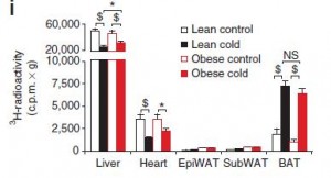
Inconsistency (or Problem #6):  Figure 2d.  Tissue distribution of 3H 15 minutes after i.v. injection of 3H-triolein-labeled chylomicrons.  Note cold liver and BAT are approximately equal at around 5,500 cpm per total tissue.

Below, they tested lean and obese mice in the same type of experiment:

Figure 4i.  Cold liver is about 3x higher than cold BAT.  The units are different, first experiment is cpm per total tissue, second is cpm per gram (“c.p.m. x g” ?) or fractional uptake… but from the first two figures 1e & s4, total and fractional uptake is higher in BAT than liver.  Why is this result flipped around?  Actually, the values for BAT are pretty much the same in both experiments.  But the value for liver is almost 10x higher when corrected for the “weight of the excised tissue.”  The experiment was the same, the data are expressed differently (which is OK), but the results seem different.

Moving on.  Maybe I’m just nit-picking but there are definitely some anomalies that warranted at least a brief mention.  For example,

1. what are those tritiated molecules that are lurking in the cold plasma (figure s2)?

It’s not exclusively “degraded oleate” (whatever that means).  Perhaps some of it is degraded oleate, of which 3H20 and chain-shortened 3H-fatty acids are possibilities, but it could also be native 3H-oleate (or 3H-di- or mono-acylglycerol?).

2. In what form is the 3H remaining in BAT after 15 minutes?  I suspect it is 3H-fatty acids (but from other data they present it could actually be intact 3H-triolein). 15 minutes is too soon for the bulk of it to be 3H2O, which would reflect an extremely high fatty acid rate considering the position of the label is [9,10-3H]oleate.

3. And WHAT about at 2 hours??? 2 hours is way too long for any of the 3H to still be in fatty acids, 15 minutes maybe, but 2 hours? This is BAT after all, isn’t it supposed to be oxidative especially at 4C?

3a. It shouldn’t be 3H2O either because water doesn’t accumulate inside of adipose tissue of any color.

3b. Membranes?  But why would BAT suck fat out of the blood membranes remodeling (especially when it’s so cold!)

4. Does BAT really weigh as much as liver?  Given their densities, this would mean the brown adipose tissue depot is significantly larger than the liver.  It seems like these guys would be walking around with little humpbacks (like a camel), especially after a bolus of olive oil in the cold!

Anyway, the data are staring me straight in the face, but I’m still having trouble swallowing this new characteristic of BAT.  In the meantime, flashback 1957:

TISSUE DISTRIBUTION OF C14 AFTER THE INTRAVENOUS INJECTION OF LABELED CHYLOMICRONS AND UNESTERIFIED FATTY ACIDS IN THE RAT (Bragdon et al., 1958 JCI)

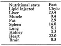
The fate of 14C from [14C]palmitate-labeled chylomicrons in rats.  The time point in this study is 10 minutes; in the Bartelt BAT study above it was 15 minutes, but that shouldn’t matter too much.

Total tissue uptake.  Most of the 14C was recovered in the liver, in agreement with Bartelt’s Figure 2d, but a significant amount is also recovered in muscle and fat, which is not the case in Bartelt’s Figure 2d.

Uptake per gram of tissue (fractional uptake).  These results are drastically different than Bartelt’s.  Liver, heart, and spleen exhibit the highest fractional uptake.  In Bartelt’s figure 4i it’s all liver.  Is this difference due to a rat/mouse thing? 10 vs. 15 minutes?  In any case, both papers agree that a lot of dietary fat/chylomicron-fatty acids end up in the liver.  In mice, maybe it’s liver and BAT, in cold mice maybe it’s all BAT, but in rats maybe it’s liver, heart, and spleen.

In humans, at least from one paper, it seems like fractional TG/FA uptake is approximately equal in fat and muscle (in agreement with mice but not rats where fat takes way more than muscle).

Preferential uptake of dietary Fatty acids in adipose tissue and muscle in the postprandial period. (Bickerton et al., 2007 Diabetes)

This study utilized the arterio-venous balance technique to measure the fractional uptake of [U-13C]palmitate from a mixed meal across subcutaneous stomach fat and a forearm muscle.  However, in Frayn’s Biochemistry textbook adipose is said to take up 4-5 times more than muscle overall which is more on par with the mice and rats cited above.

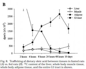
And in this rat study, whole tissue adipose uptake of 14C-oleate was higher than muscle and liver at 2 hours: Trafficking of dietary oleic, linolenic, and stearic acids in fasted or fed lean rats. (Besseson et al., 2000 AJP)

I guess I’m just trying to keep my mind off of the whole BAT thing.  Come to think of it, I’ll just do the experiment myself (in mice) to see if BAT really plays such a large role in TG clearance.  will post the results.

Calories proper

fat blog, take I

Trans fats are everywhere.  Go to your cupboards, grab any packaged food products like crackers or cereal and you will probably find the words “partially hydrogenated” in the ingredients list.  So, what are trans fats? and how bad are they?

There are two types of fatty acids: saturated (no double bonds) and unsaturated (1 or more double bonds).  Fatty acids can be relatively straight molecules, except double bonds in the “cis” configuration put a “kink” in them.  “Cis” is the opposite of “trans;” saturated fats are neither cis nor trans because they don’t have any double bonds.  See below.

Trans fats are exactly like unsaturated fats except the kink is straightened out a bit, so now they have 1 or more double bond, like unsaturated fats, but are relatively straight, like saturated fats:

It’s kind of amazing that these molecules are so similar, yet you can eat 150 grams of saturated + cis-unsaturated fat every day and live a long healthy life, or eat 5 grams of trans fats, become obese and die prematurely.

Trans fats start out as liquid cis-unsaturated fats in vegetable oils (e.g., soybean oil, canola oil, etc.).  From a manufacturing standpoint, cis-unsaturated fats are too soft and unstable.  So to put them into foods would result in a messy product that melted at room temperature and then goes rancid.  That is not exactly what you think of when you picture a delicious warm muffin, or some crispy crackers, or an oreo cookie.  Converting cis-unsaturated fats into trans-unsaturated fats is what makes the difference.  Now your favorite processed food products have the perfect consistency, taste delicious, and don’t go stale.  From the perspective of the food company, people will buy more because it tastes better, and they don’t have to worry about it going bad if there is a slump in sales.  Win-win.

The melting point of the 18-carbon saturated fatty acid “stearic acid” is ~70F (mostly solid at room temperature; e.g., steak fat).   The melting point of the 18-carbon monounsaturated fatty acid “oleic acid” is ~56 F (mostly liquid at room temperature; e.g., olive oil).  The melting point of the 18-carbon monounsaturated trans-fatty acid “elaidic acid” is 113 F (almost always solid; e.g., Crisco is still solid after sitting out in the Southern California sun all day).   FTR, room temperature is 68 – 84F

Stearic acid is pretty much always solid.  It is found in steak.  Picture the white marbling in a thick cut of beef; it is solid.  Unlike oleic acid, which is found in olive oil.  Olive oil is usually a liquid, but will solidify if you put it in the fridge for a few hours.  Oils high in elaidic acid are almost as solid as stearic acid; elaidic and stearic acids can be solid at body temperature; this is highly favorable for food companies.  That is a key temperature that is important for the deliciousness of processed foods; they melt in your mouth not in your hands

Moving on to the data:  The first paper is another seminal manuscript from the infamous Nurses’ Health Study.  In brief, the Nurses’ Health Study began in the mid-70’s and has been steadily collecting data on over 100,000 women.  This particular analysis includes a sample size of ~80,000 (for the record, that is an enormous amount of people to study).

Dietary fat intake and the risk of coronary heart disease in women. (Hu et al., 1997 NEJM)

Nurses’ Health Study

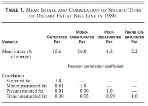
Table 1.  top half of the figure, “Mean intake.”   On average, in this population of ~80,000 women in the United States, 2.2% of total calories came from trans fat.  That’s about 5 grams on a 2,000 kcal diet.  Their average total fat intake was 37.1% , or 82 grams per day. Thus, trans fats comprise about 6 % of the total fat ingested.

bottom half of the figure “Correlation.”   Trans fat intake correlates better with PUFA & MUFA (0.55 & 0.59) than with SFA (0.30).  This is half expected and half surprising.  It’s half expected because, as stated above, trans fats are unsaturated fats, so by definition if you’re eating more trans fat then you’re eating more unsaturated fats.  It’s half surprising because you might think unhealthy people eat a lot of saturated fat and trans fat, so those two things should correlate well.  But they don’t.  It appears as though there are some people who eat vegetable oils and trans fats while others who eat saturated fats.  There is of course much overlap, but thats the gist of Table 1.

Table 2.  What are people eating?

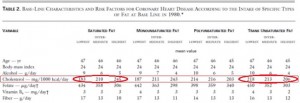
Table 2.  I love these kinds of tables; they look busy but really aren’t.  There are 4 super-columns: Saturated fat, monounsaturated fat, polyunsaturated fat, and trans unsaturated fat.  Each super-column is divided into three sub-columns: low, intermediate, and high intake levels.  For example, check out the 1st three columns in the 3rd row:  people with low saturated fat intake drink 9 grams of alcohol per day (~1 drink), people with high saturated fat intake drink less (5 grams or about a half a drink).

Now for the fun part:  cholesterol (in the red box).  Cholesterol and saturated fats are virtually always found in the same foods, so you can see that the people who ate the least saturated fat also ate the least cholesterol (red circle, 183 mg/1000kcal), and people who ate the most saturated fat also ate the most cholesterol (245 mg). Trans fats are primarily made out of vegetable oils, and there is no cholesterol in vegetable oils. People who ate the least trans fats also ate the most cholesterol (218 mg), and people who ate the most trans fat also ate the least cholesterol (206 mg).  These tables have the kind of stuff that becomes common sense but only after you think about it for a while.

Back to the half surprising point from above; maybe it should have been only 25% surprising. Healthy people try to avoid both saturated and trans fats, and healthy people who eat the least SFA or trans fat also eat the most fiber (last row in Table 2).  So all those things group together and can be seen in the table.  The advantage of this kind of table is that it independently breaks down each nutrient.  The disadvantage is that sometimes the common sense stuff doesn’t become common sense until you’ve thought about it for a long time, but I guess that’s true with a lot of things.

Moving on, to the bottom half of table 2:

similar trends…  People who eat the least saturated or trans fats also exercise the most, smoke the least, etc.  Where do you fit in?

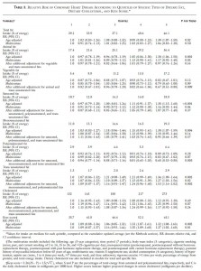
Below is Table 3 in its entirety, but don’t worry we will not be considering very much of it.

Divide and conquer.

Of all the variables on that table, Trans fats carry the highest relative risk for CHD:  

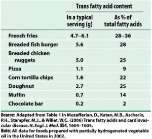
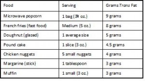
For the highest quintile of trans fat intake compared to the lowest, relative risk is 1.53, or people who consume 2.9% of total calories as trans fats (~8 grams) have a 53% greater chance of developing coronary heart disease than people who consume 1.3% of total calories as trans fats (~2.9 grams).  A difference of only 5 grams per day can increase your risk by half!  Where can you find 5 grams of trans fat ?  I thought you’d never ask:

Holy sh!t 9 grams of trans fat in a bag of microwave popcorn?!?  So microwave popcorn causes irreversible lung damage and heart disease too?

(Note the absence of real food on those two charts)

Back to the data:  Furthermore, the Nurses’ Health Study seems to exonerate saturated fats a little.  The age-adjusted risk for the highest saturated fat intake (18.8% of total calories or 41 grams) compared to the lowest (10.7% or 24 grams per day) is pretty high: 1.38 or 38% greater risk of CHD.  Well, back to that ‘common sense’ theme, unhealthy people eat a lot of saturated fat and trans fats.  Trans fat is the real bad guy, so when the data are controlled for trans fats, the risk of eating a lot of saturated fat completely went away (see red circle).

The relative risk is “1.07,” which would mean a 7% increased risk for CHD.  BUT:  The numbers in paranthesis after the relative risk are the confidence interval.  In brief, when the confidence interval includes “1.0” as it does here (1.0 is between 0.77 and 1.48), there is no longer a statistically significant association.

And the same thing happened to animal fat:

The adjusted risk for eating 36.4% (81 grams) compared to 17.4% (39 grams) of total calories from animal fat is “0.97” which would mean there is a 3% reduced risk for CHD if you ate more animal fats.  BUT the confidence interval includes “1” so there is no statistically significant association.

In the Nurses’ Health Study of ~80,000 women in the United States, CHD risk was not associated with intake of saturated fat, animal fat (or cholesterol), and was significantly associated with trans fat.  My take?  If you are at risk for CHD, avoid trans fats like the plague.  And microwave popcorn.

calories proper

the mortality blog

Influence of individual and combined health behaviors on total and cause-specific mortality in men and women: the United Kingdom health and lifestyle survey. (Kvaavik et al., 2010 Archives of Internal Medicine)

The United Kingdom Health and Lifestyle Survey looked at the relationship between mortality and the following four variables:

Smoking (never, former, current);

fruits and vegetables (> or < 3x per day);

physical activity (> or < 2 hours per week); and

alcohol consumption (> or <  2/d for women or 3/d for men)

Importantly, the analysis was designed to specifically address poor behaviors; it wasn’t how many vegetables you ate; it’s whether you eat more or less than 3 servings per day.  This simplifies things statistically, but it kind of excludes healthy people.  In other words, this study cannot tell you if 8 servings of veggies per day are better than 5 (a question that would be relevant to healthy people), it can only tell you if it’s bad to have less than 3 (a question that’s really only relevant to unhealthy people).  And this study says nothing about ‘what’s the worst thing for you;’ keep in mind that it only says how bad for you are those 4 pre-specified variables.

Data were collected in 1984 on ~5,000 people in the UK who were born before 1966 (they were at least 18 years old), and follow-up lasted until 2005.

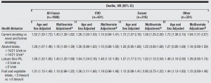
Pretty much, the whole story is summarized in Table 1.

??

Lies, damned lies, and statistics.

Divide and conquer.

The hazard ratio is calculated as follows: take the first group, smoking, “never smokers.” Of the 1,591 people who never smoked, 214 died during the study.  The rate of death among never smokers is therefore: 214 / 1591 = 0.13.  Of the 2,124 people who were current smokers when the study began, 497 died.  The death rate for smokers is 497 / 2124 = 0.23.  The hazard ratio for smoking is 0.13 / 0.23 = 1.74; current smokers had 74% increased risk of dying compared to never smokers.  For former smokers, the risk was actually much worse; they had a 134% increased risk of dying.  NOTE: that is not because quitting smoking is bad for you.  Former smokers have already done a lot of damage to their health by smoking, and smokers who are very sick are very likely quit smoking but are also still very likely to die.  These are correlations not causations.   In any case, the reason why my numbers don’t match the table is because their data are “statistically adjusted.”

Going by their hazard ratios, of the 4 poor habits in question, being a current smoker is the worst (83% increased risk of dying compared to never smokers).  In terms of mortality risk, smoking is worse than regularly drinking in excess, getting less than 15 minutes of physical activity per week, and eating zero fruits or vegetables.  Nutrition is important, but not as important as not smoking.

The next worst factor was getting less than 15 minutes of physical activity per week. OK, so nutrition is important, just not as important as exercise and not smoking.  Actually, their nutrition variable had pretty much no significant correlation with all-cause mortality.

Moving on, Table 2. All cause and cause specific mortality

Again, the worst risk factor is current smoker, which was strongly associated with cancer mortality; getting < 2 hours of physical activity per week was strongly associated with CVD and all-cause mortality.

So if someone has all 4 poor behaviors, they should 1) stop smoking, 2) exercise just a little bit, 3) drink less alcohol, and 4) eat more fruits and vegetables.  If they only have 1 poor behavior it doesn’t really matter that much.

IMHO if someone asked what I considered a poor nutrition behavior, it wouldn’t be “too few fruits and vegetables.” People don’t get sick because of eating too few of anything, they get sick from eating too much.  I would have said a poor nutrition behavior is something like “> 3 servings of processed foods per day” or “too much damn sugar” because obesity and obesity-related disorders are the number one causes of death and those two behaviors do far more harm than fruit does good.  (too much processed foods and sugars can cause obesity; too little fruit cannot)

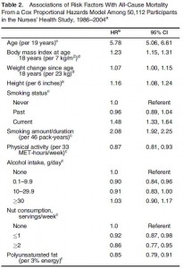
jump back over the pond to:  Risk Factors for Mortality in the Nurses’ Health Study: A Competing Risks Analysis (Baer et al., 2010 American Journal of Epidemiology)

The Nurses’ Health Study is one of the biggest epidemiological investigations of all time.  This study included young and middle aged nurses who completed multiple questionnaires about diet and lifestyle in 1980, 1984, and 1986.

The basic outline is similar to the UK study, and according to the table above, smoking triumphed again as the worst.  But wait, table 2 continued:

A Ha! diabetes is worse than smoking.

So perhaps eating more than 3 servings of vegetables per day isn’t as good as never smoking, but being diabetes-free is the best.  However, there is one important caveat.  This view of the data doesn’t exclude a relatively extreme interpretation.  I.e., eat as much junk food as you’d like and as long as you don’t develop diabetes, your lifespan won’t be affected.  A better interpretation needs to exclude that possibility because, unfortunately, people cannot eat as much junk food as they’d like and not get diabetes.

However, this study wasn’t about what led to the leading causes of death, it was about the leading causes of death.  It’s a bit cryptic, but I think it means 1) don’t smoke and 2) don’t do anything that causes diabetes…

glycemic load”  shows a pretty good correlation with all-cause mortality.  Glycemic load is basically how much your diet increases your blood sugar.

Glycemic load is increased by:

1)       eating a greater quantity carbohydrates; or

2)       eating higher glycemic index carbohydrates

We know a high glycemic load contributes to diabetes from an earlier publication on the Nurses’ Health Study

the 800 pound gorilla, no pun intended..  is it too much of a stretch to say your best chance of dying is:

“glycemic load –> diabetes –> mortality”

?

more thoughts about the data: Having a drink a day (~10% reduced risk vs. teatotallers) or getting a little bit of exercise (13% reduced risk) were good for you, but not good enough to compensate for smoking (>100% increased risk) or a carbohydrate-rich diet (22% increased risk due to glycemic load; >100% increased risk for diabetes).  I’m usually very nutritionally biased; for example, the cause of everything can be traced to nutrition.  In the UK study they didn’t ask about glycemic load or diabetes, but they said smoking carried the greatest risk for all-cause mortality.  In the Nurses’ Health Study, smoking was bad but diabetes was worse.  I imagine the findings about diabetes would have been similar in the UK study had they asked.  So my conclusion from these studies is that the universal order of things (or just how the majority of us will go) is most likely: “glycemic load –> diabetes –> mortality”

One more study, from the National Center for Health Statistics

The preventable causes of death in the United States: comparative risk assessment of dietary, lifestyle, and metabolic risk factors (Danaei et al., 2009 PLOS Medicine)

Briefly, these authors made a death-rank chart to display the 12 quantitatively biggest contributors to mortality in the United States.  Nutrition isn’t number one, but it did capture ~10 of the top 12.

calories proper